
 |
 |
 |
 |
 |
 |
 |
 |
Japanese 「罰」 calligraphy. way of writing 罰 [kanji]
| Japanese | Reading (Example) | ||
| 罰 | |
||
|
|
written with a brush 「罰」 calligraphy 罰 letterings
Basic typeface [Japanese] Even difficult characters are displayed in large font size so you can see the details.
Different typeface designs give a very different impression.
Different typeface designs give a very different impression.
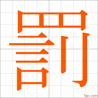
| Japanese written in Mincho font | |||
 |
|||
| 罰 | バツ、バチ | ||
| Mincho font | 1-bati.jpg | ||
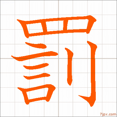
| textbook-style kanji | |||
 |
|||
| 罰 | バツ、バチ | ||
| textbook style | 2-bati.jpg | ||
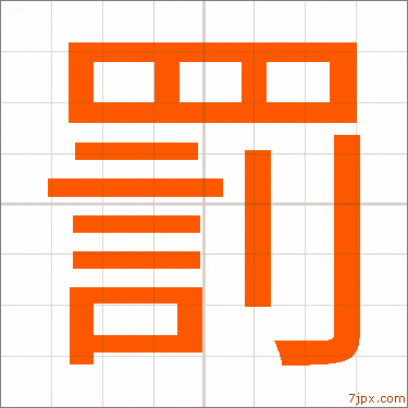
| Japanese Kanji written in Gothic style | |||
 |
|||
| 罰 | バツ、バチ | ||
| Gothic typeface | 3-bati.jpg | ||
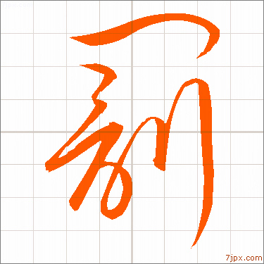
| Japanese kanji written in calligraphy | |||
 |
|||
| 罰 | バツ、バチ | ||
| handwriting style | 4-bati.jpg | ||
|
|
|
|
|
|
|
|
|
|
 |
 |
 |
 |
 |
 |
 |
 |
||
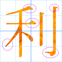
| The design of the beginning and end of the letters is distinctive. |
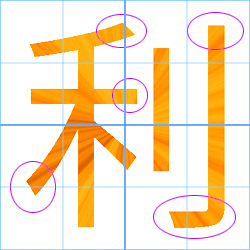
The thickness of the vertical and horizontal lines are uniform. |
当ホームページの利用における全て一切の責任を負いません
Copyright (C) en.4ndex.com . All rights reserved.