
 |
 |
 |
 |
 |
 |
 |
 |
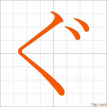
Japanese 「ぐ」ひらがな見本 ぐ書き方
| hiragana | Reading (Example) | ||
| ぐ | |
||
|
|
written with a brush 「ぐ」 calligraphy ぐ letterings
By looking at the hiragana as "displayed characters" you can recognize the number of strokes and the vertical and horizontal balance.
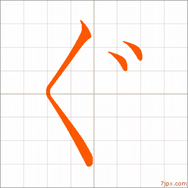
| Mincho font | |||
 |
|||
| ぐ | ぐ | ||
| Mincho font | 1-gu.jpg | ||
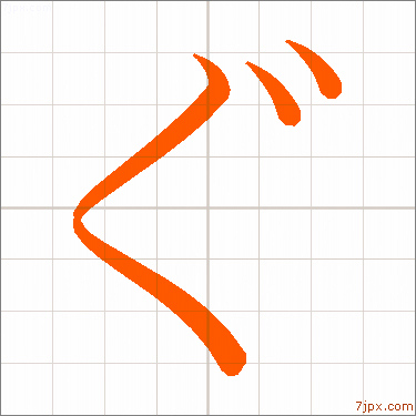
| textbook style | |||
 |
|||
| ぐ | ぐ | ||
| textbook style | 2-gu.jpg | ||
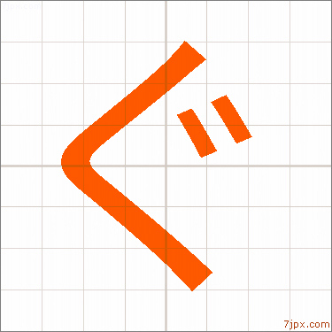
| Gothic font | |||
 |
|||
| ぐ | ぐ | ||
| Gothic typeface | 3-gu.jpg | ||
| 明朝体の太字で書いた平仮名 | |||
 |
|||
| ぐ | ぐ | ||
| 明朝体の太字 | 4-gu.jpg | ||
|
|
|
|
|
|
|
|
|
|
 |
 |
 |
 |
 |
 |
 |
 |
||
| The design of the beginning and end of the letters is distinctive. |
The thickness of the vertical and horizontal lines are uniform. |
当ホームページの利用における全て一切の責任を負いません
Copyright (C) en.4ndex.com . All rights reserved.